Increasing Vaccine Bookings at CVS Health
Increasing Vaccine Bookings during Peak Vaccination Seasons
No time to read? Click or tap here for a TL;DR
~ An Overview
Context
As a Senior Product Designer on the Manage Your Prescriptions team,
The Problem
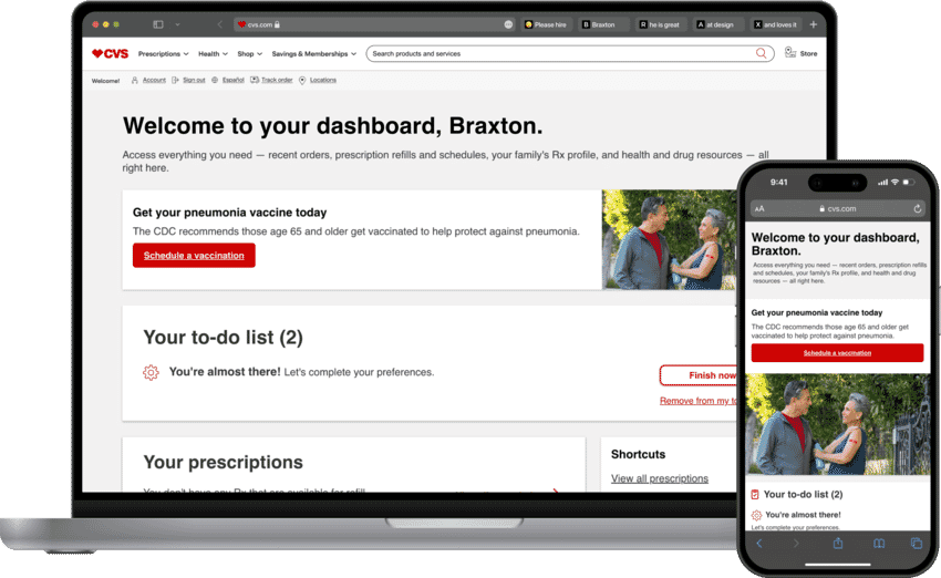
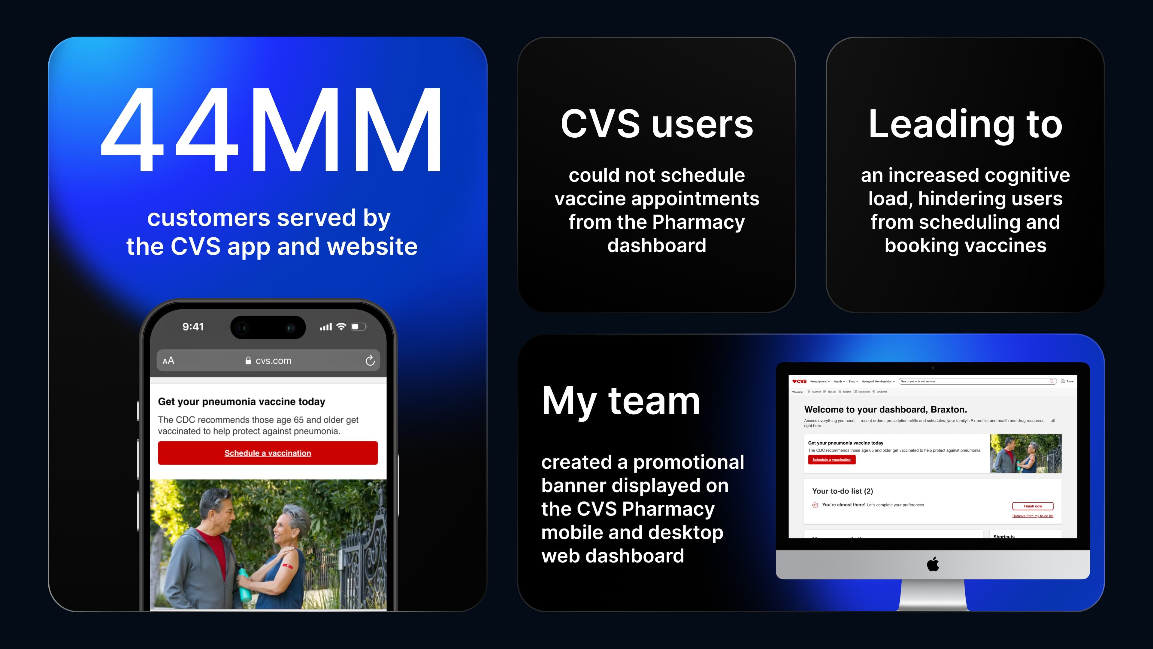
For customers who utilize it, the CVS Pharmacy dashboard showcases recent orders, prescription refills and schedules, and their family's prescription profile, alongside health and drug resources.
The Challenge
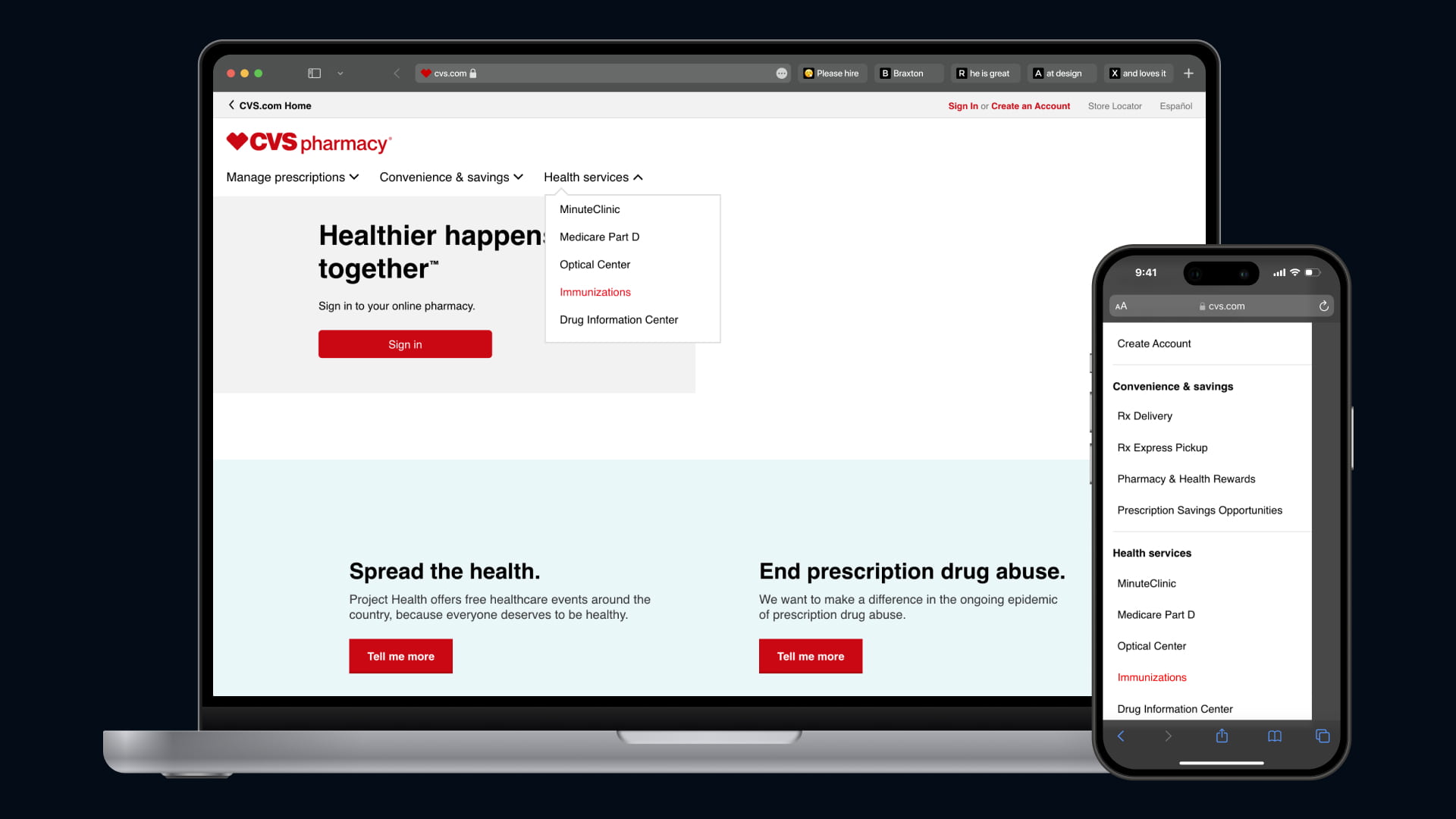
The Manage Your Prescriptions team was tasked with determining how to effectively prompt customers to book a vaccine from the Pharmacy dashboard during peak seasons or when they were due for a vaccine based on their demographics, ensuring we didn't distract them from their dashboard experience.
How might we enable customers to book vaccines from their Pharmacy dashboard and highlight recommended vaccines based on their demographics without distracting from key dashboard elements?
Pausing for Clarity: This promotional banner is only displayed on the authenticated version of the CVS Pharmacy dashboard in peak seasons.
My Role Included:
Defining design direction, strategy, research, prototyping, testing, stakeholder presentations, and collaboration with developers.
Our Solution:
My team and I created a promotional vaccination banner to be displayed on the CVS Pharmacy dashboard during peak vaccine seasons.
The Result – This is a spoiler! Click or tap here to show the result.
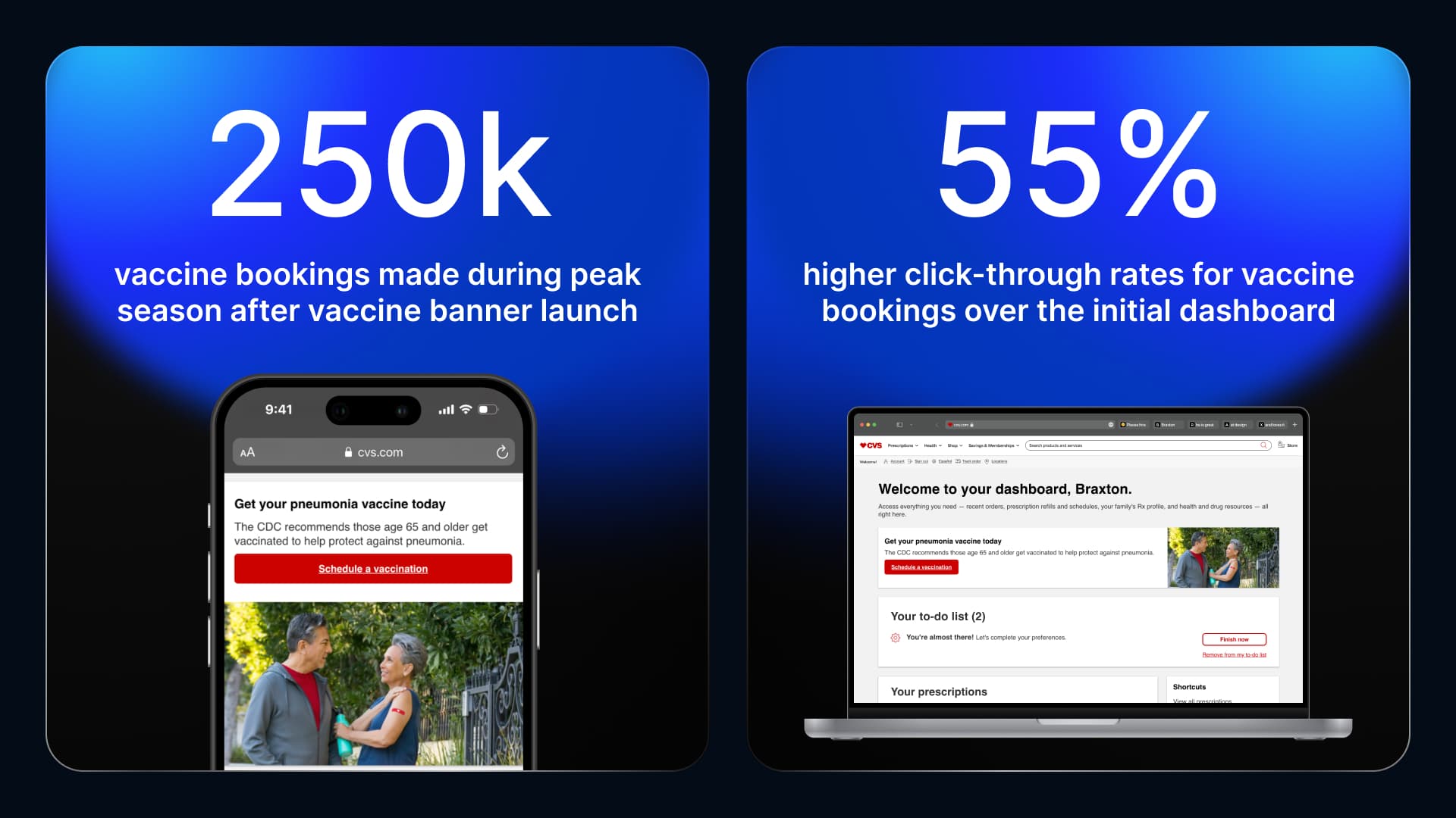
By streamlining the booking approach and allowing users to start the booking process from the Pharmacy dashboard, we:
• Increased vaccine bookings at CVS by over 250,000+ during peak vaccine seasons by implementing a strategically designed vaccine banner on the Pharmacy dashboard.
• Increased click-through rates for vaccine bookings by 55% starting from the Pharmacy dashboard compared to the dashboard without any vaccine prompts.
Take a look at the final prototypes linked below:
1. Researching the Problem
Primary Research
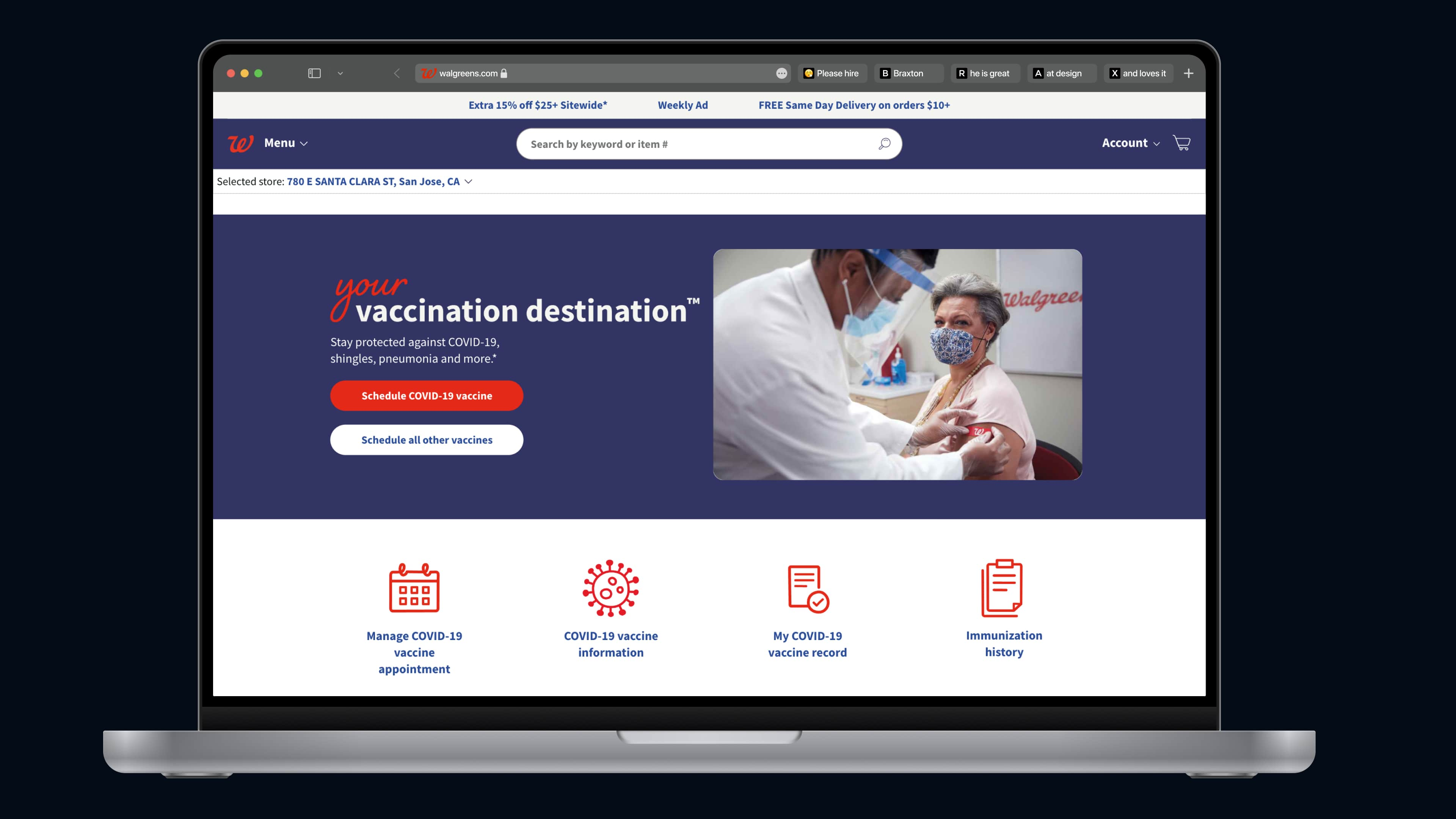
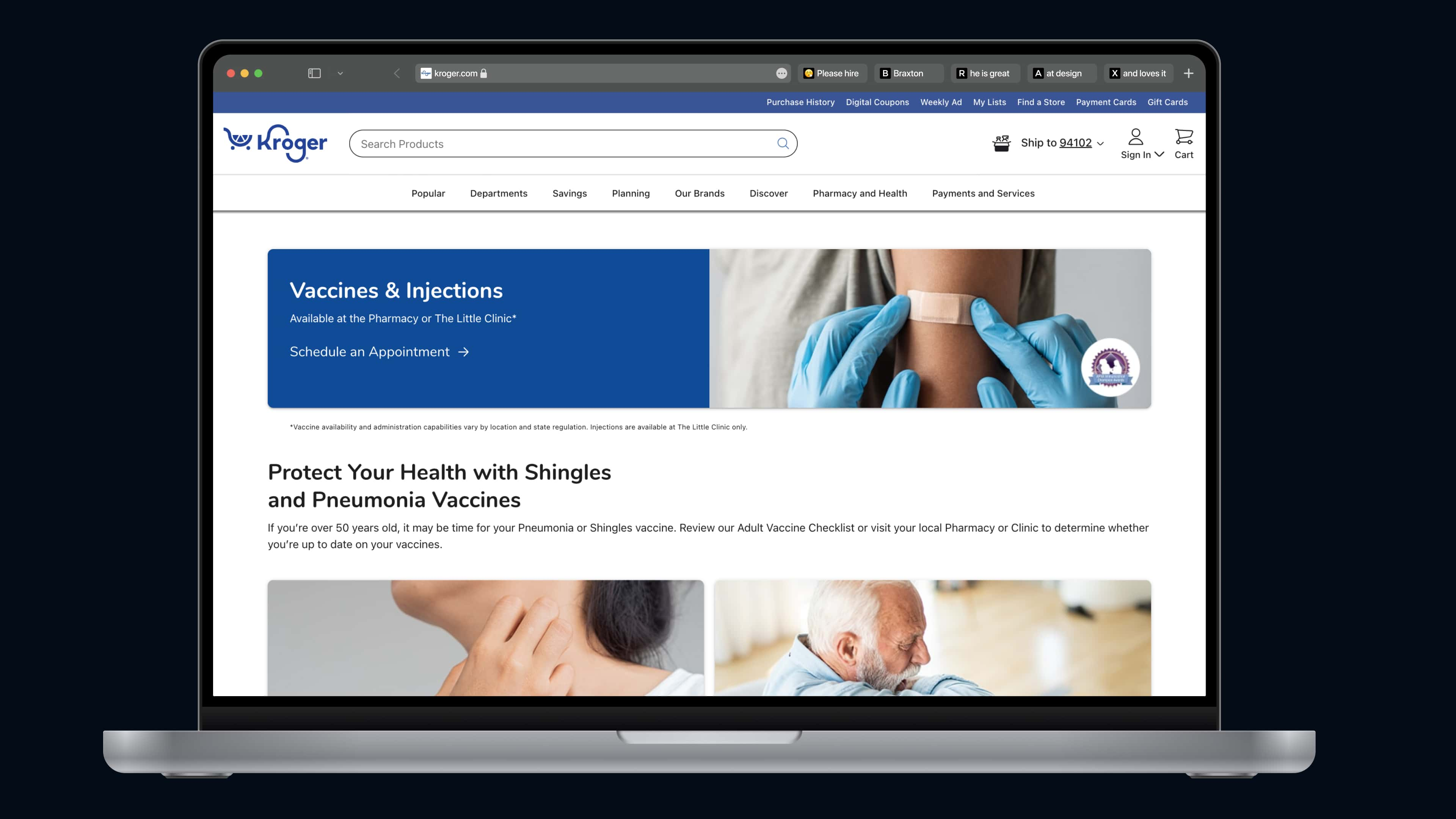
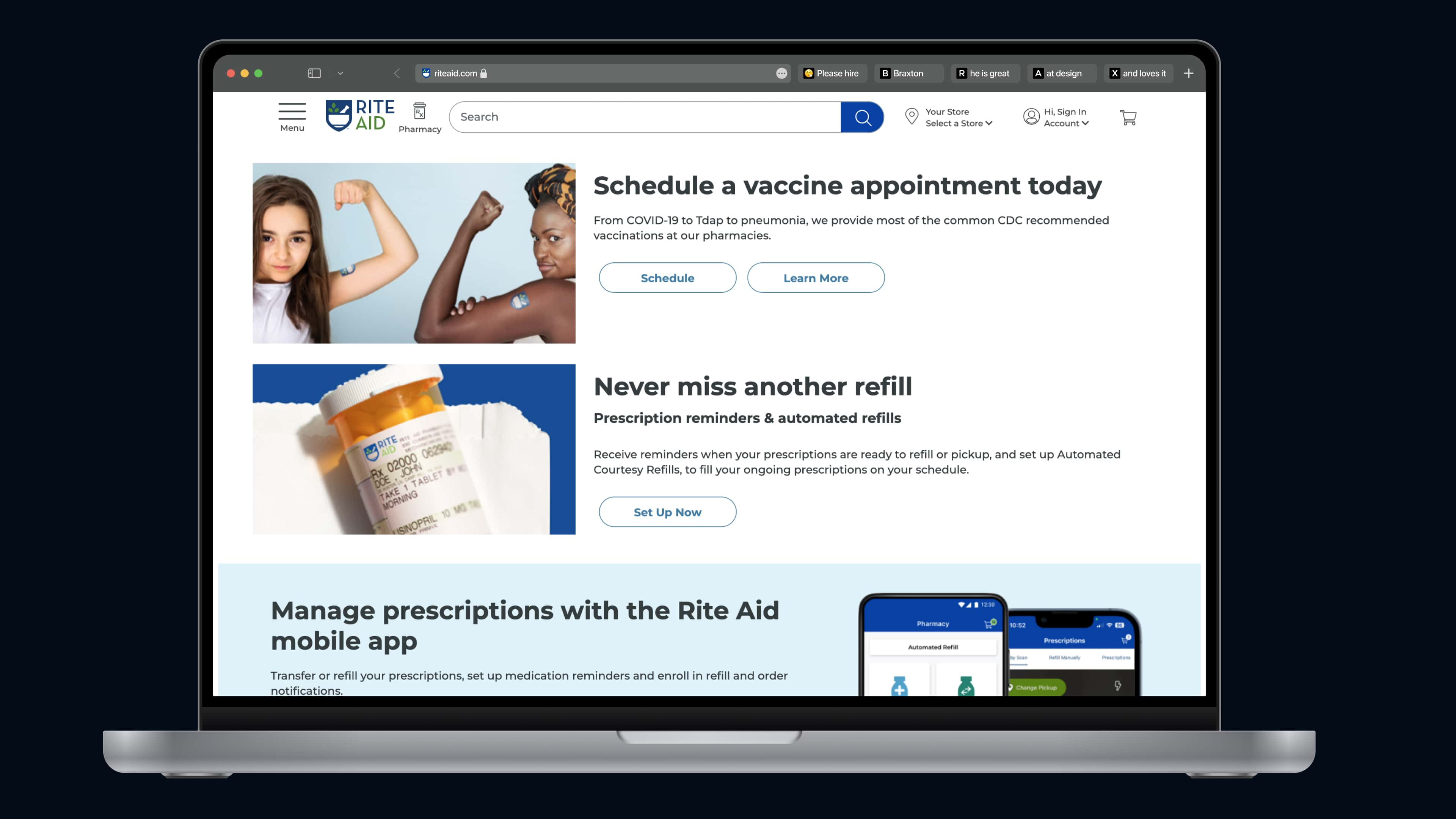
I observed that companies strategically used positioning, styling, and structure to present essential and recommended information in locations where users would find it to be most beneficial.
- Positioning: Used to display contextual information that encourages users to take action or consider acting on a banner prompt.
- Styling: Used to create visual callouts, ensuring promotional banners showcasing important health information are noticeable by users.
- Structure: Used to capture user's attention, draw focus to key areas, and provide sufficient information to prompt recommended next steps.
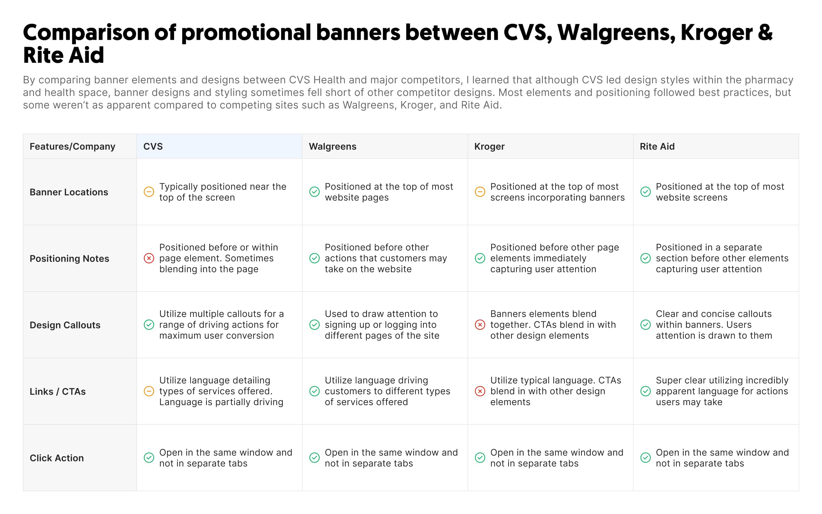
A Competitive Analysis
2. Ideation
Defining the Direction
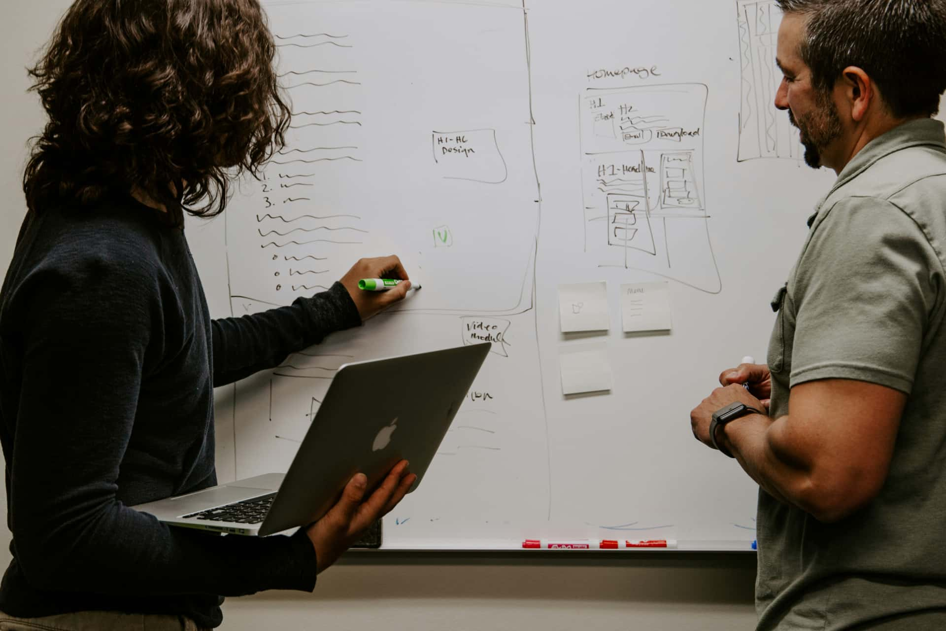
After conducting further research and ideation on using a promotional banner for this feature, I met with the product team to discuss next steps.
Analyzing the User Journey
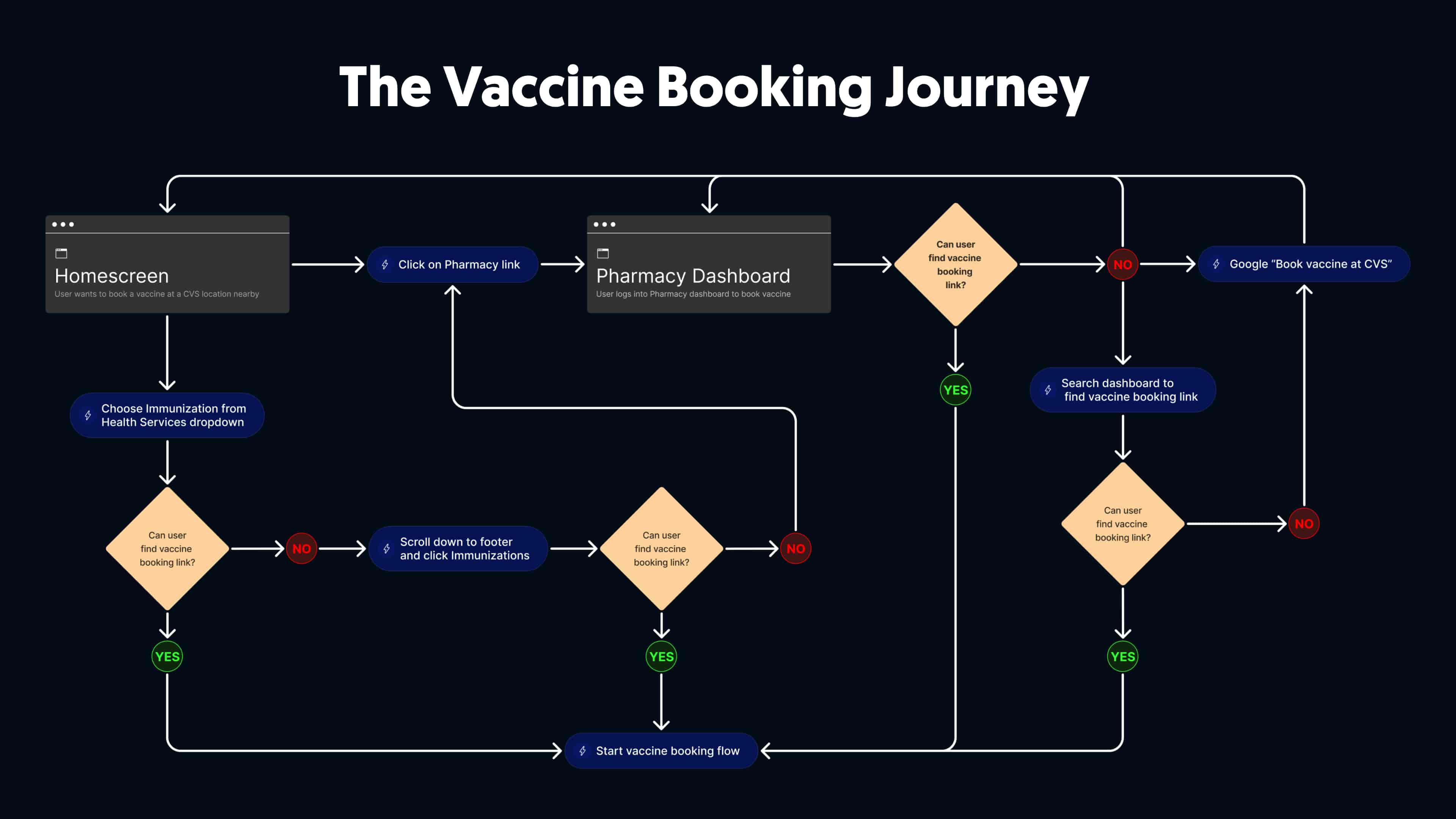
To best determine the styling and positioning of the vaccine banner, I dove into dissecting the user journeys that would lead customers to star the vaccine booking flow.
As shown below, a user would end up on the Pharmacy dashboard via different routes.
Sketches
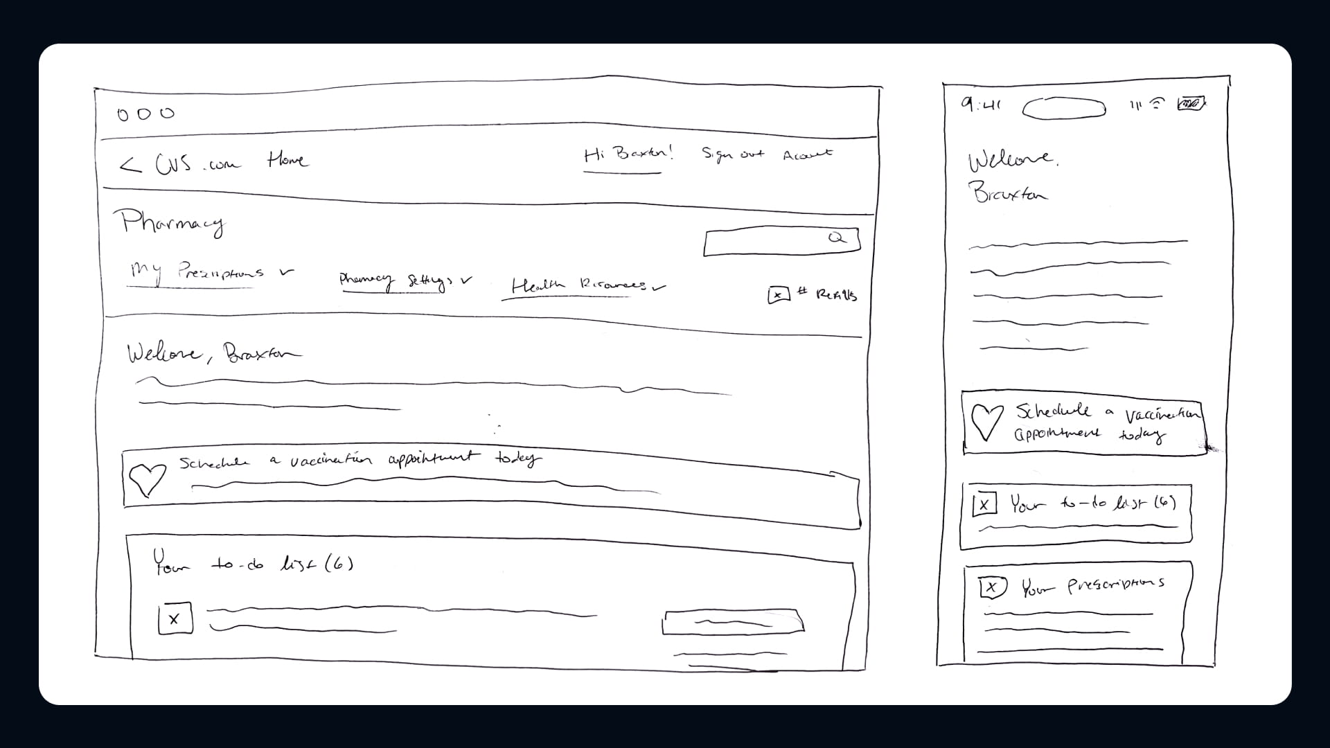
After further discussions with my team, the product team, and stakeholders, I sketched a few versions of the vaccine banner.
These sketches allowed me to define and visualize key design decisions before moving on to wireframing, prototyping, and testing.
Wireframing
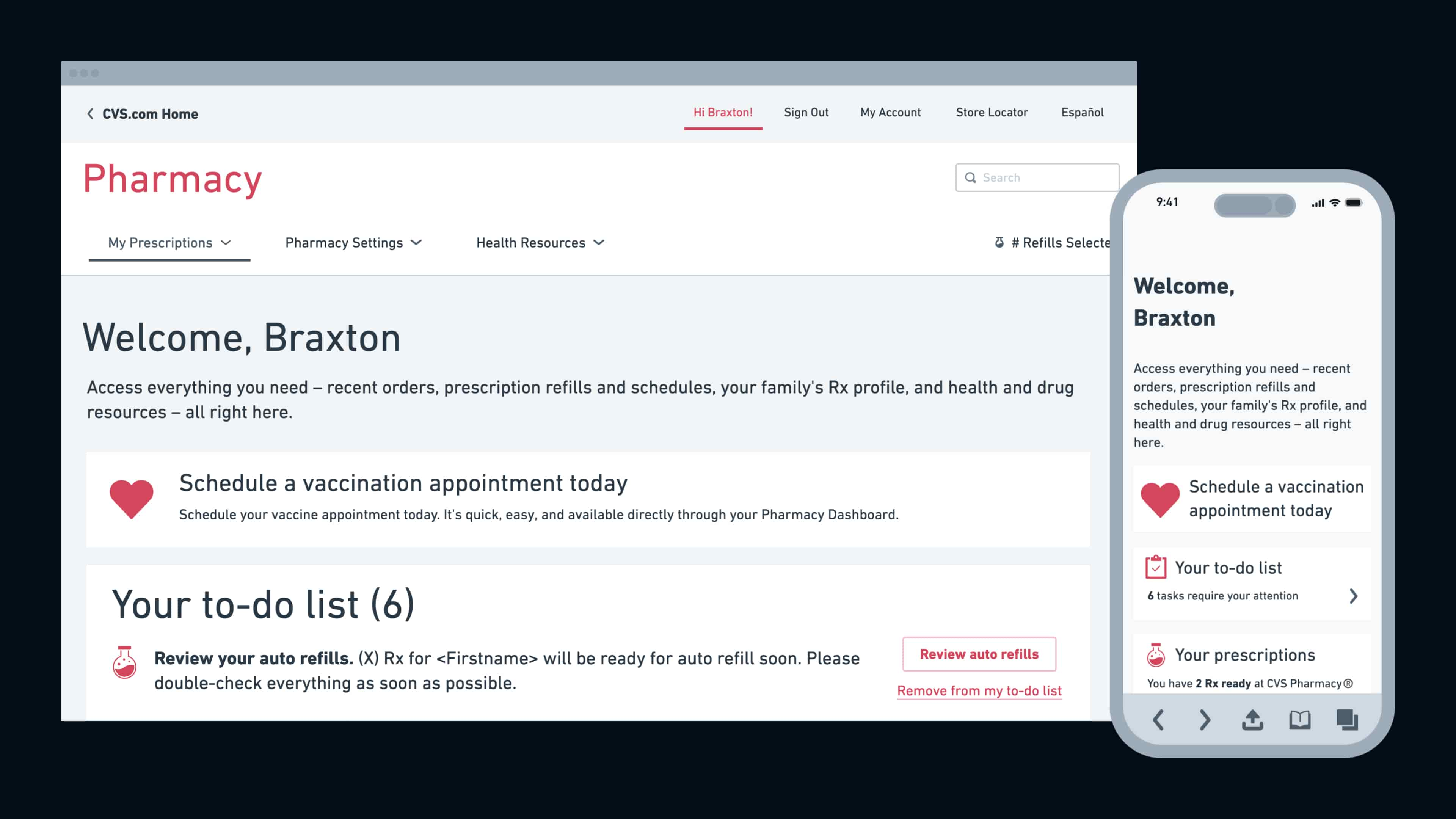
Once I identified the ideal locations for the vaccine banner, I created wireframes to help detail its placement.
3. Prototyping & Testing
Designing the Prototype
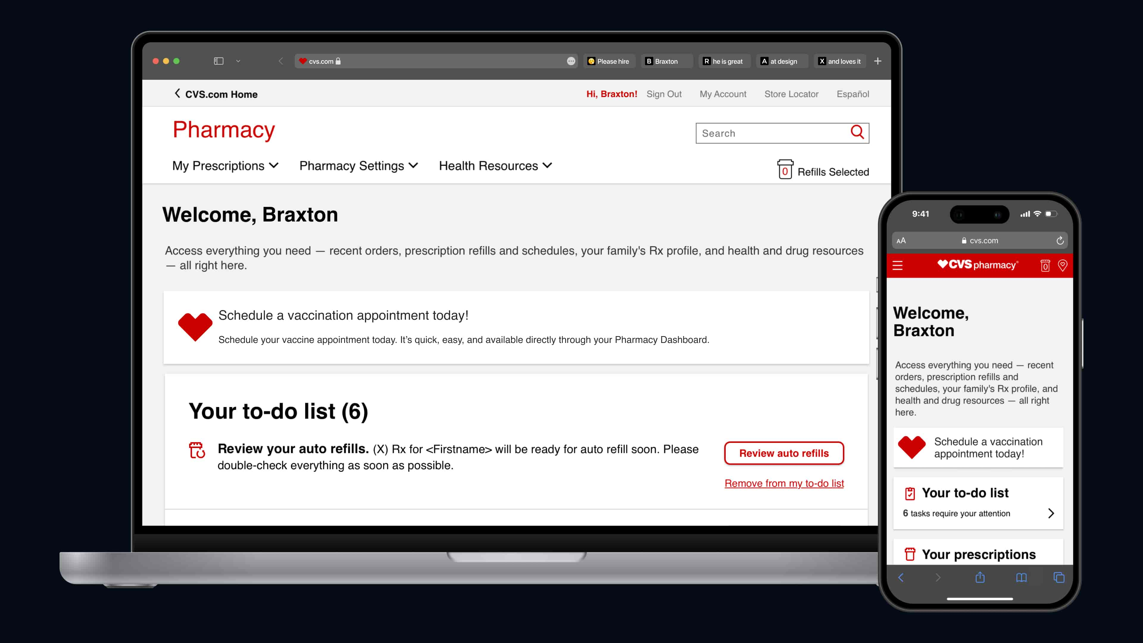
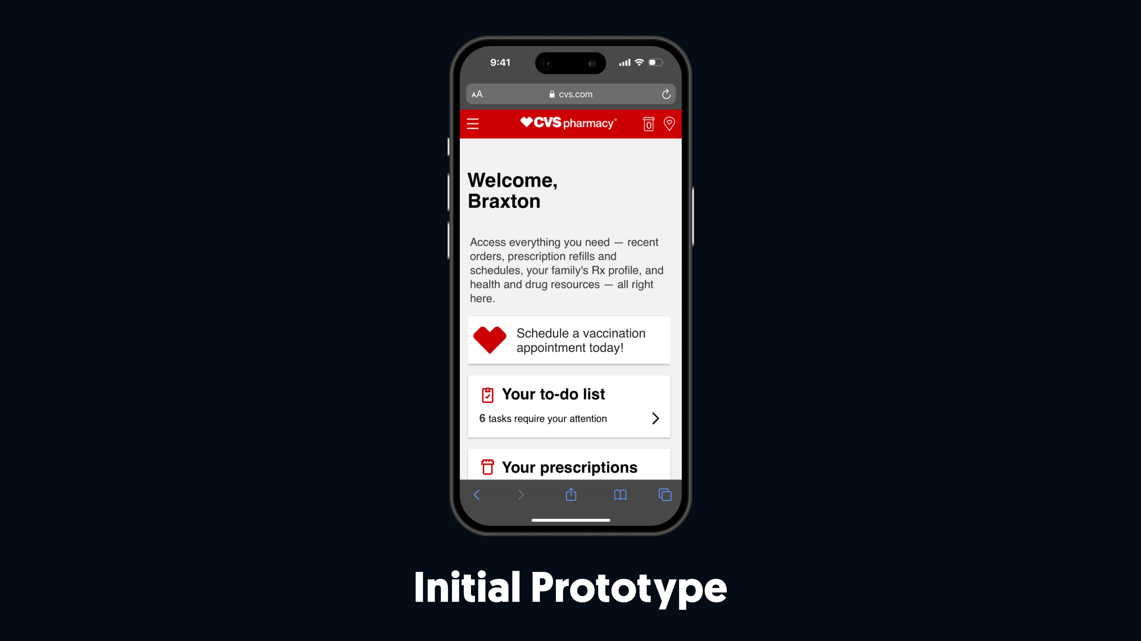
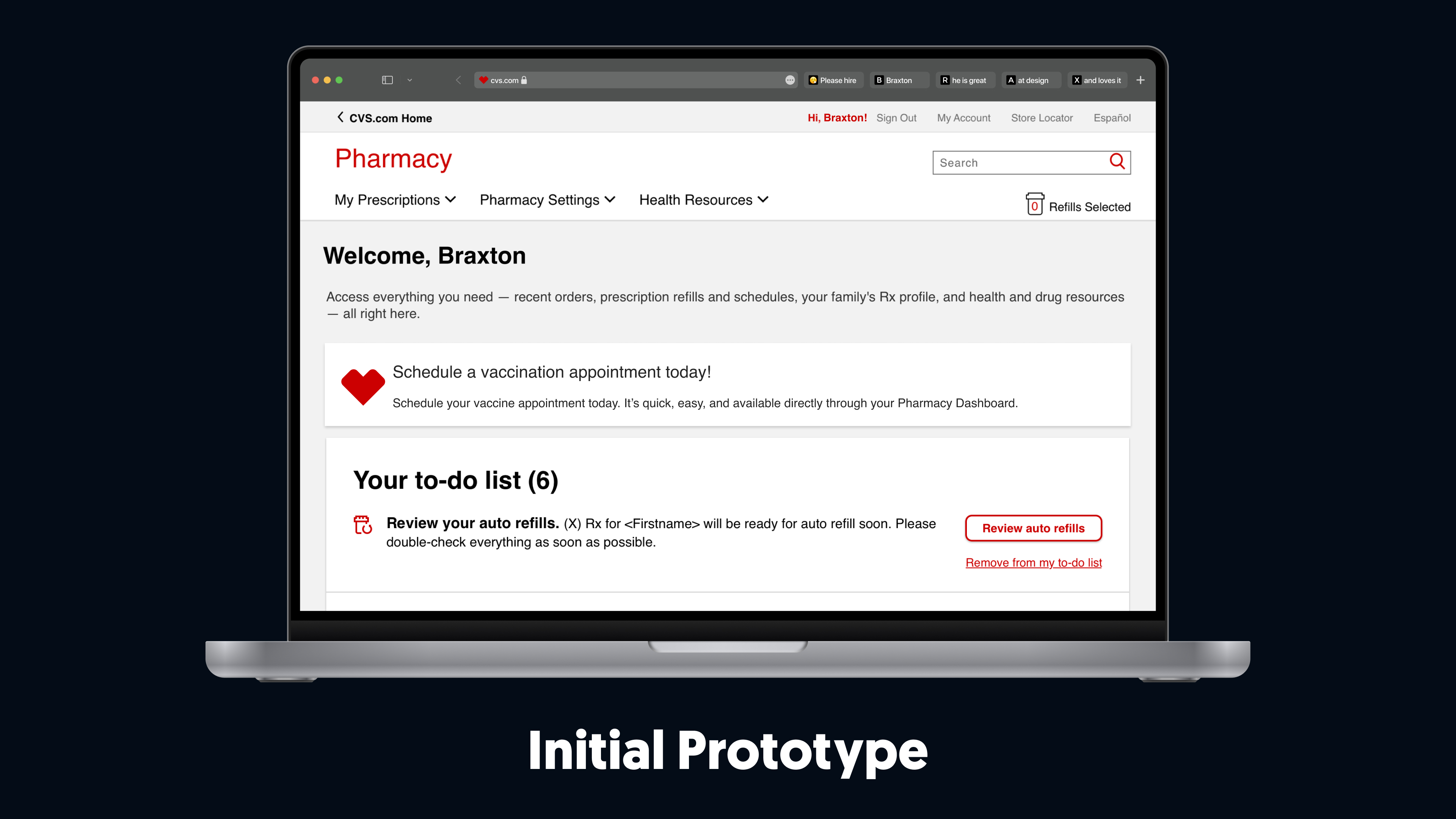
I developed the initial prototype for testing using the sketches and wireframes.
Figma also provided an easy route for quick changes during testing.
Piloting the Designs with Customers
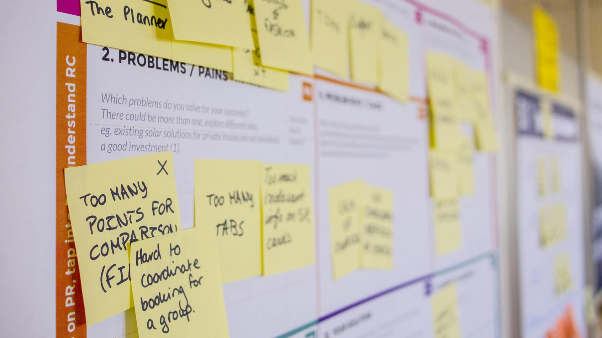
The UserTesting test provided my team with valuable insights into how each version of the vaccine banner benefited customers and how its styling impacted their experience.
1. The banner with no call to action wasn’t clear or helpful. Users often wondered why CVS would display so much vaccine information with such a small call to action.
2. Users would rather see imagery than text only; including imagery drew users to the banner. Without imagery, users thought the banner was another part of their dashboard, leading them to often miss the banner completely.
3. Copy needed to convey essential information to users clearly. Rather than mentioning general info about vaccines, we needed to get specific about the vaccine’s benefit and why it was suggested.
4. Modifying the Design
Redesigning from Feedback
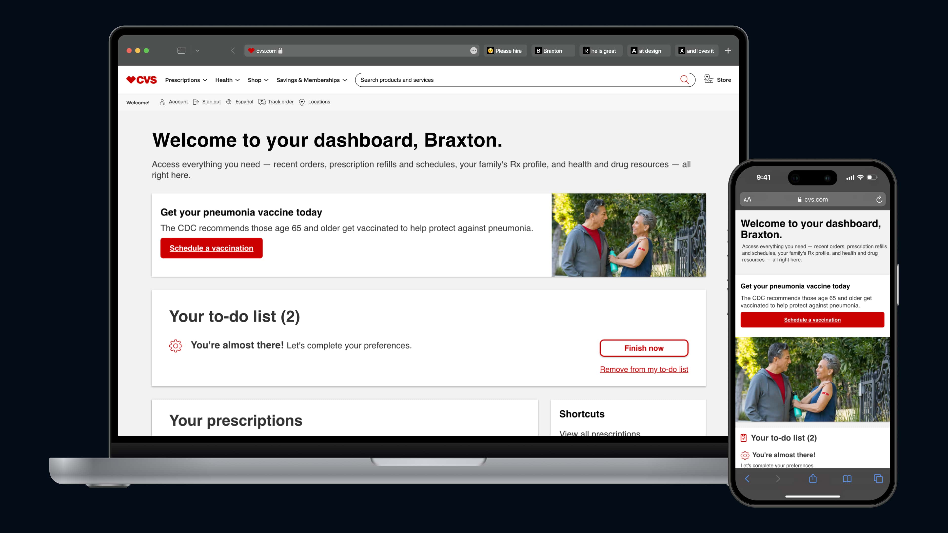
Based on the feedback and insights from the UserTesting test, it was clear that design adjustments were needed.
With these issues noted, I made the following changes from feedback:
• I reworked the vaccine banner design , focusing on creating a more prominent call to action.
• I added imagery to help distinguish the vaccine banner from other items on the Pharmacy dashboard.
• I collaborated with the copywriter on my team ensuring the copy was clear and concise.
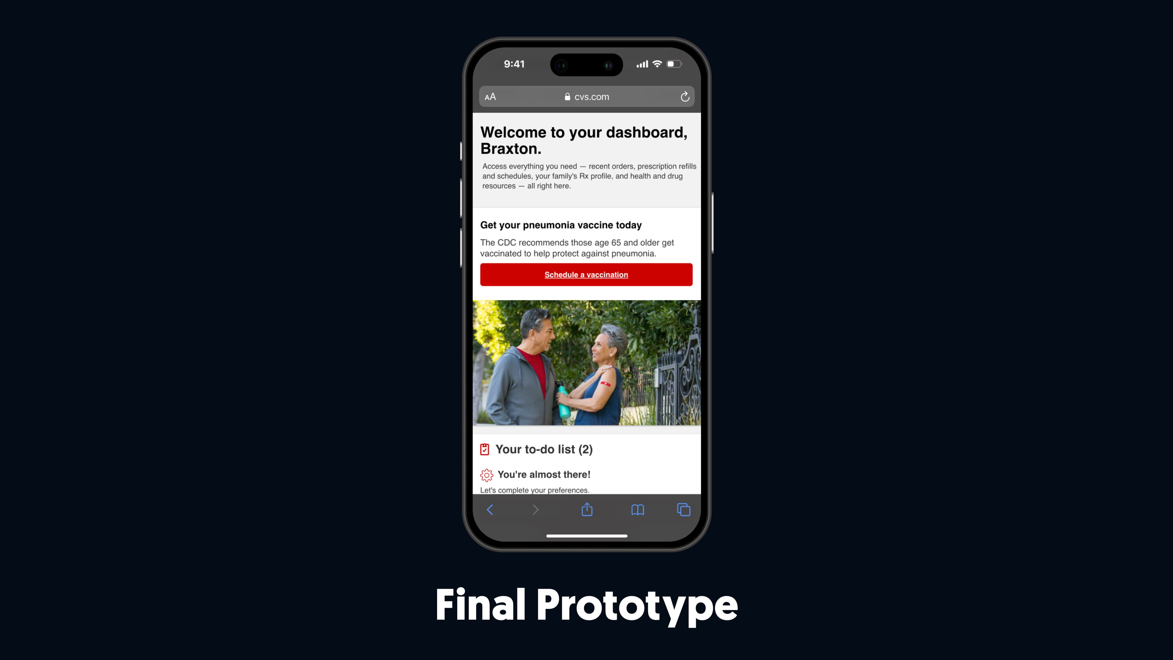
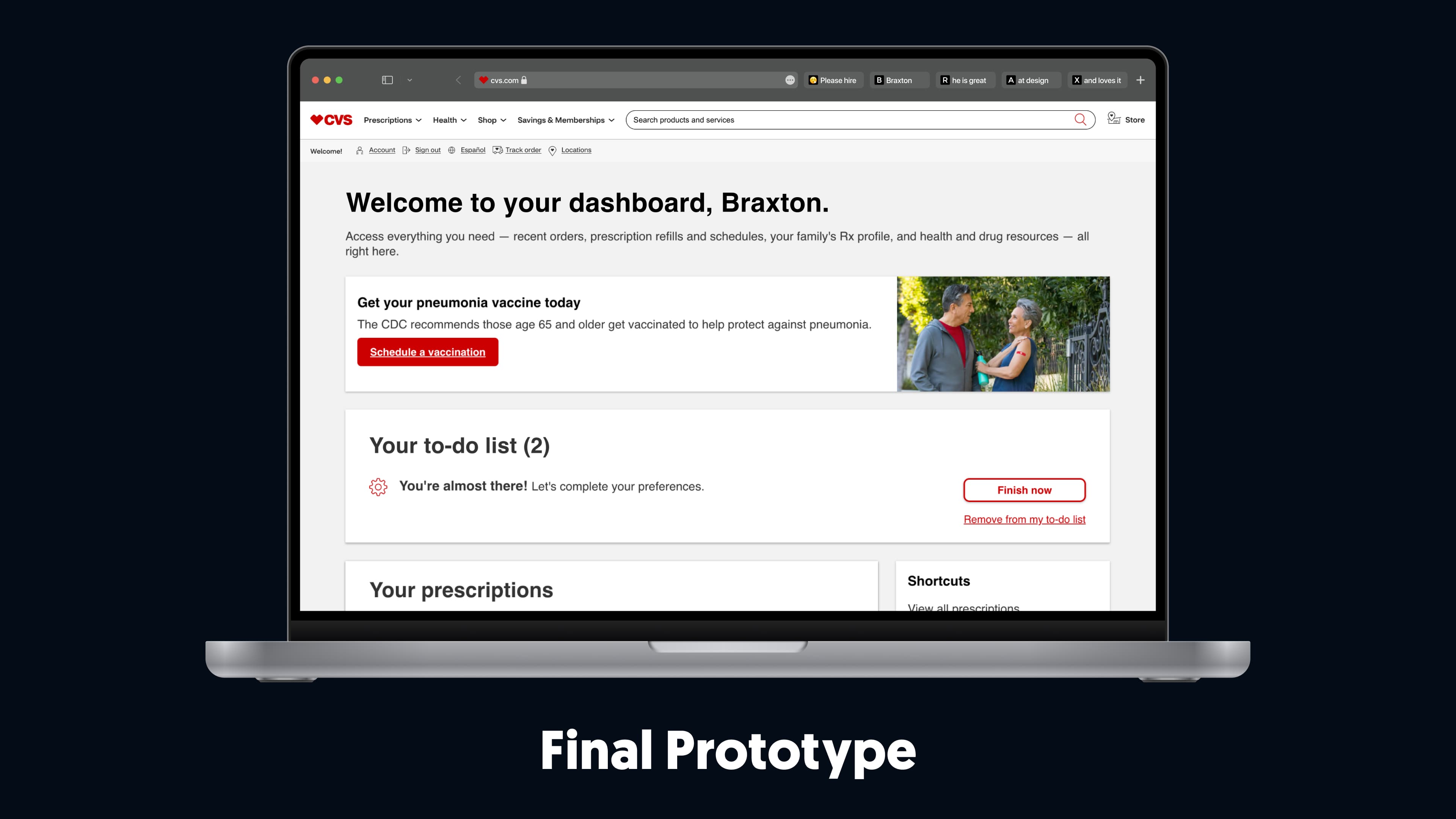
Testing the Redesign
• The call to action was more prominent. Users found it easier to spot and more obvious than the previous inline, text-link design.
• The imagery quickly drew user's attention to the banner , helping them recognize it as a distinct element on their dashboard rather than just another dashboard item.
• Users better understood the information provided , why vaccines were recommended, and how they could benefit from recommended vaccines if booked.
Preserving Designs in Discussion with Stakeholders
After gathering this feedback from the product team, I shared the updated designs with stakeholders. Some stakeholders were skeptical about placing the vaccine banner at the top of the screen with concerns that it would disrupt other necessary actions on the dashboard.
5. Handing off the Finalized Design
Conversations with Engineering
- Rather than simply assuming the developers were familiar with the details from previous discussions,
I took the time to provide clear annotations for each element in each supported viewport of the vaccine banner.
- Instead of trying to lead the team from the start,
I spent time getting to know the team, discussing the best approach to this design project, and ensuring that I communicated clearly and directly with them during the entire design process.

Handing off Finalized Designs
My team and I shared the high-fidelity designs with the developers.
Take a look at the final prototypes linked below:

6. Launch
Statistics from Going Live
After my team handed off our designs and had them implemented, I spoke with the product team to gather some stats to share with my team.
• Increased vaccine bookings at CVS by over 250,000+ during peak vaccine seasons by implementing a strategically designed vaccine banner on the Pharmacy dashboard.
• Increased click-through rates for vaccine bookings by 55% starting from the Pharmacy dashboard compared to the dashboard without any vaccine prompts.

7. Reflecting
Looking Back

What I Learned
To avoid this, I ensured that I wrote clear updates and communicated consistently in the styles of my teammates for a holistic understanding of updates and changes.
The challenges I encountered taught me the value of taking detailed notes during meetings my teammates couldn’t attend and translating them into communication styles that worked best for the team.

What I Would Do Differently
This didn’t hinder progress, but it caused some initial hesitation in collaboration.

Thanks for Reading!
I appreciate the time you’ve taken to read through my case study and get an understanding of my process. Please reach out if you have any questions about my work Increasing Vaccine Bookings at CVS Health! I’d love to discuss it with you.
Feel free to take a look at another project by clicking one of the links below.
